This is Article #2 in my series about Oracle APEX on mobile Devices.
If you haven’t read the first one, please do so now.
This Article is based on the current release of Oracle APEX 4.0.2.00.07, but should also work on APEX 3.x and 4.1.
With Oracle APEX 4.1 and later there will be more options and possibilities which let you create an even better mobile Application, more to that in a later Article in this series.
This time we’ll start to build an Application which runs and adapts to mobile devices.
Create the Application
At first we create a new Application, pick any Theme you like but make sure that you don’t use Tabs.
The first/starting Page in our Application will consist of a List, which will be the main menu, and two other Pages with a Report and a Form. In my Demo Application I use the Table DEMO_CUSTOMERS which comes with the APEX Sample Application.
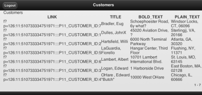
Page 10 (Customers) is a classic SQL Report with that Statement:
SELECT 'f?p='||:APP_ID||':11:'||:APP_SESSION||'::::P11_CUSTOMER_ID:'||CUSTOMER_ID AS LINK
, cust_last_name || ', ' || cust_first_name                                  AS TITLE
, CUST_STREET_ADDRESS1 || decode(CUST_STREET_ADDRESS2, null, null, ', ' || CUST_STREET_ADDRESS2) AS BOLD_TEXT
, cust_city ||', '|| cust_state ||', '|| cust_postal_code                    AS PLAIN_TEXT
from demo_customers
ORDER BY CUST_LAST_NAME, CUST_FIRST_NAME
Page 11 (Customer) is a standard APEX-Form based on Table DEMO_CUSTOMERS (simply use the wizard to create it).
Page 1 contains a List-Region. At first create a new List (Main Menue) under Shared Components with a List entry pointing to Page 10. Then you can create the List-Region on Page 1 which uses this new list.
You can run this Application right away, but you’ll see that it isn’t rendered for mobile Devices. At this point it is just a normal APEX Application like all the other Applications you already have created.
create a new Page Template
Telling our Application to do some special rendering for mobile Devices is done with the Page Template. There we include jQuery mobile and define the required HTML5-Structure of the Page, as required per the jQuery mobile Documentation.
Now simply copy one of the existing Page Templates and replace the following code snippets in the respective options:
Page Template Header
<!DOCTYPE html>
<html lang="&BROWSER_LANGUAGE." xmlns="http://www.w3.org/1999/xhtml"
xmlns:htmldb="http://htmldb.oracle.com" xmlns:apex="http://apex.oracle.com">
<head>
<title>#TITLE#</title>
<link rel="icon" href="#IMAGE_PREFIX#favicon.ico" type="image/x-icon">
<link rel="shortcut icon" href="#IMAGE_PREFIX#favicon.ico" type="image/x-icon">
#HEAD#
<link rel="stylesheet" href="http://code.jquery.com/mobile/1.0a4.1/jquery.mobile-1.0a4.1.min.css" />
<script type="text/javascript" src="http://code.jquery.com/jquery-1.5.2.min.js"></script>
<script type="text/javascript" src="http://code.jquery.com/mobile/1.0a4.1/jquery.mobile-1.0a4.1.min.js"></script>
</head>
<body #ONLOAD#>
<div  data-role="page">
#FORM_OPEN#
Page Template Body
      <div data-role="header" data-backbtn="false">
<h1>#TITLE#</h1>
#NAVIGATION_BAR#
</div><!-- /header -->
<div id="messages">#SUCCESS_MESSAGE##NOTIFICATION_MESSAGE##GLOBAL_NOTIFICATION#</div>
<div data-role="content">
<ul data-role="listview">
#REGION_POSITION_01#
#REGION_POSITION_02#
#REGION_POSITION_03#
#REGION_POSITION_04#
#REGION_POSITION_05#
#REGION_POSITION_06#
#REGION_POSITION_07#
</ul>
#BOX_BODY#
</div><!-- /content -->
Page Template Footer
      <div data-role="footer">
<h4>#REGION_POSITION_08#</h4>
</div><!-- /footer -->

#FORM_CLOSE#
</div>
</body>
</html>
Page Template Navigation Bar Entry
<a href="#LINK#" rel="external" #ALT#>#TEXT#</a>
Save the Page Template and set it as Default Template in the Theme Definition.
After starting the Application you can see a different Layout than before.

create a new Region Template
Create a new and empty Region Template and copy this code:
Region Template Definition
<div id="#REGION_STATIC_ID#" #REGION_ATTRIBUTES#>
<h2>#TITLE#</h2>
<div data-role="controlgroup" data-type="horizontal">#CLOSE##PREVIOUS##NEXT##DELETE##EDIT##CHANGE##CREATE#
#CREATE2##EXPAND##COPY##HELP#</div>
<div>
#BODY#
</div>
</div>
Again set this new Region Template as Default in the Theme Settings and use it in all already created Regions.
This now takes care of the Region Title and the Region Buttons, both are now rendered for mobile Devices.
create a List Template
The Home Page shall be the main Menu of the Application which is an APEX List. To make this look good and work on mobile Devices we need a new List Template with the following Definitions.
List Template Before Rows
<ul data-role="listview" data-inset="true">
List Template Current
<li><a href="#LINK#" rel="external">#TEXT#</a></li>
List Template Noncurrent
<li><a href="#LINK#" rel="external">#TEXT#</a></li>
List Template After Rows
</ul>
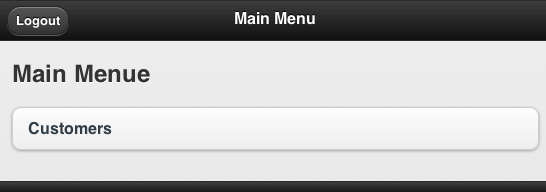
After setting the new Template as Template for the List on Page 1 it instantly looks great.

create a Report Template
There is a vast variety on mobile Devices with differen Screen Sizes, Screen Resolutions and Capabilities. Standard APEX Reports won’t fit on most of the Screens, so we choose a different approach and create a Report Template for named Columns. This way we have more control over the Layout.
Create a new Report Row Template with the following Definitions:
Report Template Row Template 1
<li>
<a href="#LINK#" rel="external">
<h3>#TITLE#</h3>
<p><strong>#BOLD_TEXT#</strong></p>
<p>#PLAIN_TEXT#</p>
</a>
</li>
Report Template Before Rows
<ul data-role="listview">
Report Template After Rows
</ul>
This Report Template expects that the Report SELECT Statement returns the Columns LINK, TITLE, BOLD_TEXT and PLAIN_TEXT. What you put in these Columns is totally up to you, just create any SELECT Statement and use the expected Column names as alias.
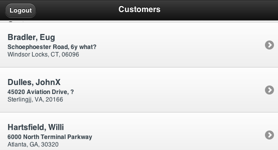
Using this new Template for our Report on Page 10 gives it a nice look.

As you can see we created a mobile Application with just a few changes on Templates. Of course this is just a first draft and there are some things to polish up and take care of (like Navigation, Buttons, Charts, …). See what’s possible in the mobile Demo Application
More tipps on APEX for mobile Devices in the next Article – so stay tuned!
Also Join me for a webinar on June 20th when I will go through my APEX for mobile project


Hi Peter,
In order pagination to work properly in reports, I added an “after refresh” dynamic action for the report region with this line of code:
$(“ul”).listview();
Hi Peter,
I followed your tutorial exactly according to instructions and it works almost perfectly. There are some buttons that don’t seem to work well. The Logout button for instance. When I click on it (or touch from a smartphone) the loading spinner appears and stays there while the page doesn’t change. Although, I found that if I refresh the page after having clicked on the logout button, the session actually closes. I did some research but there is nothing that I find about this issue. (i’m using APEX 4.0)
Regards, David
David, try adding rel=”external” to the Logout Link.
” …Create a new Report Row Template with the following Definitions:
Report Template Row Template 1 …”
Hi,
I am using the jQuery theme and I can’t find the Row Template 1 anywhere in there. Can you please point me to where it is.
Thank you.
Hello , Peter Raganitsch .
First congratulations on the excellent topic regarding Mobile has with jQuery .
My name is Eric Novaes and I am Brazilian, I wonder if there would be conditions to share this application contained in http://www.click-apex.at/apex/f?p=mobile link for study purposes .
Thank you very much in advance.
Regards.