This is Part 2 in my Blogpost Series on improving the APEX mobile Theme. I recommend to read Part 1 before continuing here.
Last time we covered how to create Report Templates that look like Listviews to give you better Pagination and more control over the Layout.
APEX Lists
Lists in APEX are very powerful and can be used almost everywhere. Their great advantages are supporting hierarchy, authorizations and conditions.
They come in handy as menu, as tabs, as list, as taskbar, for navigation and so on. I bet you can add more things to this list.
In mobile APEX Development this is not different and therefor the mobile Theme comes with 4 different List Templates:
- List View
- List View (Inset)
- Button Control Group
- Navigation Bar
Here is a screenshot where I use the List View (Inset), Button Control Group and Navigation Bar.
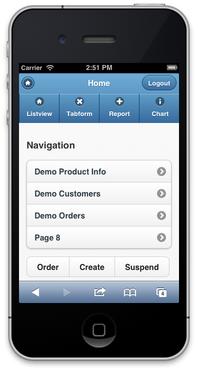
Listview again :-) So there are now 3 ways to define a Listview. That again proves how important Listviews are in mobile Applications, they can be used for Navigation as well as to display Data.
On top of the screenshow, right below the Header-bar, you can see the Navigation List (with JQM Icons). On Bottom of the Page you see an example of a Button Group. Basically those are condensed Buttons where we avoid unnecessary white space between the inner Buttons.
That actually looks pretty nice, but we can make it better.
Button Control Group Template
As you can see in this screenshot the Button Control Group would support Icons, but those would have to be defined in A01, which is a rather odd place and hard to remember.
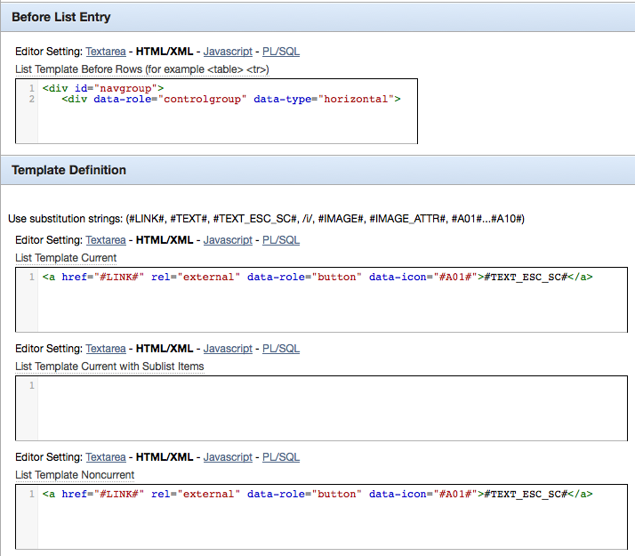
To know what else we can improve its important to consult the JQM Documentation again, especially the Data Attribut Reference.
This tells us a couple things: first the buttons can be horizontal or vertical stacked (data-type=”horizontal”) and we can have Icons and different sizes. See the JQM Example Page and the Icon Reference.
Of course we cannot make everything completely generic and controlable through List-Entry-Settings, but we can provide some of those options. This is what the configuration screen of a List Entry looks like:
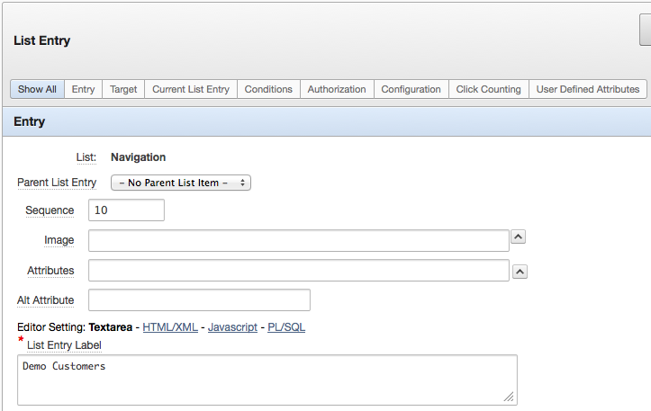
That alone gives us some settings we could use, without even touching the User Defined Attributes.
Basically all we have to do is make a small change in the List Template Current/Noncurrent:
<a href="#LINK#" rel="external" data-role="button" data-icon="#IMAGE#"
#IMAGE_ATTR# >#TEXT_ESC_SC#</a>
This change now takes the icon-name out of the Image-Setting and uses the Attributes-Setting to inject other config.
For example you could write data-mini=”true” into the Attributes-Setting to get smaller Buttons, or use data-iconpos=”notext” to have a icon-only button without text. You can also switch to another color using data-theme=”a” (or b, c, d, e…).
If you want to distinguish between current and noncurrent items you can add class=”ui-btn-active” to the current Template.
Another good idea here is duplicate that Template and use data-type=”horizontal” in “List Template Before Rows” for the first one and data-type=”vertical” for the second Template.
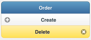
These tiny changes give us already a whole new set of possibilities. Suddenly a Button Group isn’t static anymore, but can change its look and feel simply by adding attributes to the List Entries.

Navigation Bar
Navigation Bars in mobile are used like Tabs in Desktop Applications, see the Documentation for some examples.
This is how it comes predefined by APEX:
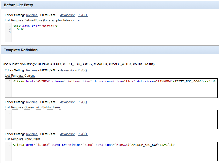
Looks pretty good already, as you can see here the APEX Dev Team used the #IMAGE# Placeholder for the data-icon. So all we will do for now add the #IMAGE_ATTR# Placeholder as we did for the Button Control Group.
That is enough to give us the flexibility we want. Here an example of a Navigation Bar.
![]()
Looks fine, unless you omit the Icons. Then it shows too much padding on top:
![]()
This happens because JQM thinks there should be an image, because although we haven’t specified one the created HTML-Code still has the data-icon attribute with an empty value.
To remove that padding copy that Navigation Bar Template and rename it to “Navigation Bar (no Icons)”. Edit it and remove data-icon=”#IMAGE#”. Now the Navigation Bar can be shown without that padding.
![]()
As said before there are tons of possible settings and you cannot crunch everything in a single Template. Sometimes its better to have flexible Templates, some other times you’ll have multiple Templates with just slight variations.
Enough for Part 2 of our series, to be continued soon…

Which version of apex did you use on this tutorial?
I see 4.2.1 in the first article…but
I am trying to create the top level navigation bar (like yours) but the page template does not display the region with the navigation bar… which i placed inside the after header regions
Only if I place it in the body… which does not look very nice…