I finally can start on a new mobile Application, for the first time using Oracle APEX 4.2.1 for a productive mobile App.
All my other mobile Applications have been built with previous Versions of APEX and my self made themes.
So apologies for writing that blogpost so late. But better late than never, right?
If you already developed some mobile Apps with APEX 4.2 you might have found the offered functionalities and templates a good start, but still with room for improvement.
So here are my ideas, maybe one or two things are picked up by the APEX Dev team and included in 4.2.2
Review
The first thing i do when using new themes – and in this case its the mobile theme 50 – is reviewing the templates and checking the HTML-Code. For the mobile theme this is a pretty quick task, as there are only 30 templates (APEX Desktop themes come with around 75 templates).
The review showed me a couple things:
- the templates use 5 Swatches (as explained in this blogpost), which makes it hard to change colors and styles, but is totally ok
- there is a single Report template, but this one proves not well suited for mobile devices
- the Page template defines the meta-tag as webapp allowed (that lets you run a special mode without the browser itself) -> unfortunately that has some drawbacks on the iOS platform when using authentication
- List templates are inconsistent, as just some of them support icons and those use different methods (one uses the Image attribut, the other one A01)
- the Popup LOV template isn’t mobile friendly
Hm, yeah, enough reasons to dig in deeper and start improving the templates.
For now we don’t touch the Layout itself and the use of Swatches a-e and just take this for granted, otherwise we would have to change the used CSS as well and that would be too much for this post.
Report
Reports on a Smartphone screen are very tricky, because there is just not enough room to have many columns next to each other. So we have to think of someting different than a column oriented list layout and think of how we want to show the data to the customer and which parts of that are actually important to see in a Report (which is meant as overview, not as analysis Report).
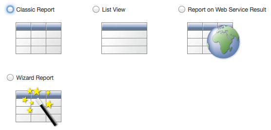
 The best method i found is using Listviews. “But hey”, you might say, “there is already a Listview component in APEX”. And you are right, instead of creating a Report you can create a Listview Component. The main difference here is that you have full control over your Report and Report Template, whereas you have only limited settings for the Listview Component and its appearance.
For me the biggest drawback in using the Listview Component is the Pagination. In a Report i have full control over Pagination and also can come back to the same Report Page later.
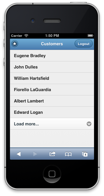
The Listview simply shows a “Load more” Link to fetch the next set of records, but adds them to the existing records. That means your screen grows longer and longer, which can easily cause problems on mobile devices as soon as you reach a couple hundred records.

Now we create a Template for a Report, that looks like a Listview and behaves like a Report. Fantastic, isn’t it?
At first we create a simple Template which only shows a single line per Record, after that we will use a more complex Layout.
Create a new Report Row Template named “Simple Listview” with the following Definitions:
Report Template Row Template 1
<li>
#1#
</li>
Report Template Before Rows
<ul data-role="listview">
Report Template After Rows
</ul>
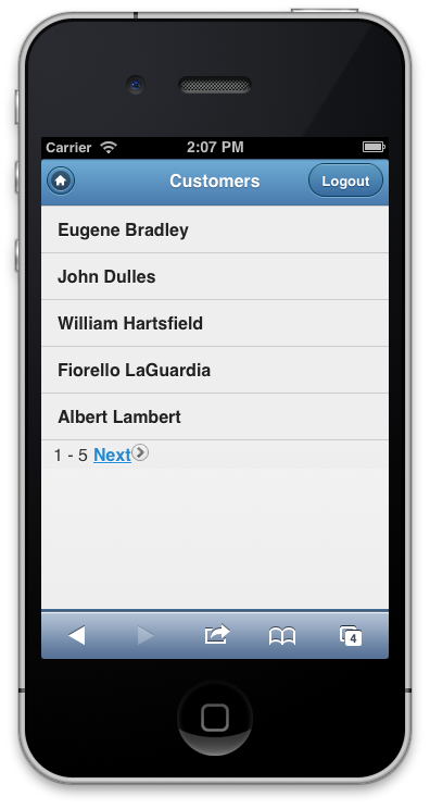
The Placeholder #1# will be replaced by the first Column in your Report Query. When we create a Report and try that out it looks like this:

For the complex Layout create a new Report Row Template named “Complex Listview”.
Create a new Report Row Template named “Simple Listview” with the following Definitions:
Report Template Row Template 1
<li>
<a href="#LINK#" rel="external">
<h3>#TITLE#</h3>
<p><strong>#BOLD_TEXT#</strong></p>
<p>#PLAIN_TEXT#</p>
</a>
</li>
Report Template Before Rows
<ul data-role="listview">
Report Template After Rows
</ul>
This Report Template expects that the Report SELECT Statement returns the Columns LINK, TITLE, BOLD_TEXT and PLAIN_TEXT. What you put in these Columns is totally up to you, just create any SELECT Statement and use the expected Column names as alias.
Alternatively you can use the numbered Placeholders #1#, #2#, #3# and so on to referer to the first, second, third column of your Report Query. Both ways work, to me the named Placeholders make it easier to get their meaning.
Lets change the Query of the Report to return those additional Columsn:
SELECT 'f?p='||:APP_ID||':11:'||:APP_SESSION||'::::P11_CUSTOMER_ID:'||CUSTOMER_ID AS LINK
, CUST_LAST_NAME || ', ' || CUST_FIRST_NAME                                  AS TITLE
, CUST_STREET_ADDRESS1 || DECODE(CUST_STREET_ADDRESS2,NULL,NULL, ', ' || CUST_STREET_ADDRESS2) AS BOLD_TEXT
, CUST_CITY||', '||CUST_STATE||', '||CUST_POSTAL_CODE                        AS PLAIN_TEXT
FROM DEMO_CUSTOMERS
ORDER BY CUST_LAST_NAME
, CUST_FIRST_NAME
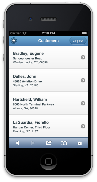
That makes our Report look much better, this way we can show as much data and style it as we want. This gives us even more control than the Advanced option of the Listview Component. Take a look at the jQuery mobile Documentation on Listviews to know what else you could add to the Report Template.

Enough for today, lets take a look at other improvements in the next Part of this Blogpost Series about mobile APEX Development.

Hi Peter,
Have you found a reliable way to render date pickers in a Windows environment for your mobile applications? iOS obviously handles this nicely, but there’s a range of behaviors with date items in Windows across the browsers.
Thanks,
Mike
Sorry, my experience with Win-Phones is very limited. If the standard behaviour isn’t good enough i’d look for a JQM Date Picker Plugin, there should be several out there.
Hi Peter,
I have been trying to use these steps for several days now. I am a co-op that is completely new to APEX (and coding), and I am not sure what I am doing wrong. I am using APEX 4.2, and here are the steps I have taken:
I created the application and page. (report->list view) I entered in my source then (select …) I didn’t change anything else.
Next, under page definition, I clicked on create under “template”. I chose report, from scratch, then borderless for the template class and named column (row template) as template type, and create.
This took me back to the page definition page, so under page template, I chose “edit” and under report, the name. From here I entered in the above code.
Hi Amy,
please share whats not working. so far you described what you did, but you didn’t tell about the outcome.
My apologies. I can only receive the list to “load more”. I’d like to get it to work as the last image you have here, so for my application I can show the user name, application, and environment. I’m also interested to see if I could use a checkbox with this code. I was going to place a slider at the top, checkboxes next to those usernames, and then a submit button at the bottom.
A side note: I was able to get the checkboxes to appear, but again I am not sure if they will work with the above code, and while I have the code I’d like to use with those boxes, I am not sure how to use them in conjunction with a slider (yes/no).
Hello Peter,
Thanks for sharing this valuable information.
I am not able to make List Divider in the report template as elaborated here:
http://jquerymobile.com/demos/1.2.1/docs/lists/docs-lists.html
#DEPT#
#EMP#
But I get the divider for each and every employee (row) instead of having one divider for all emp in the same Dept.
Is there a way to get around ?
Regards,
Sorry, I added an HTML code, but it did not show up in the previous reply:
#DEPT#
#EMP#
Fateh,
the Divider is shown every time the Divider-Column changes. So don’t use the actual Name as Divider-Column, instead use a computed column which gets the first character only: SUBSTR(ENAME,1,1) AS DIVIDER_CHAR
Hello Peter,
Thanks for your response. I understand your point. in my case, it is real estate app and the Property Type is the Divider.
Please have a look at these images:
https://lh5.googleusercontent.com/-z2UTaa0pa2o/UmvWUaeRrlI/AAAAAAAAAIg/XamrZ0WbtOc/w342-h553-no/Capture.PNG
https://lh6.googleusercontent.com/-R-70yW0_xMs/UmvWyH8PVLI/AAAAAAAAAIo/ROR36R3RL6A/w705-h301-no/Capture2.PNG
If it is not clear, I can create an example on apex.oracle.com.
Regards,